Dark patterns (or deceptive design) are deliberately manipulative design techniques that exploit human psychology to influence user decisions. These tactics exploit cognitive biases and the human brain’s natural tendency to avoid unnecessary effort, trapping users in an invisible but powerful way.
Rather than guiding the user towards informed choices, dark patterns subtly mislead, often masking important information or confusing choices.
The different types of dark patterns
The term “dark pattern” was coined by Harry Brignull in 2010, a period marked by the boom in online commerce. He created the www.deceptive.design website to denounce these practices and raise awareness among users. At the time, he identified 11 types of dark pattern, but since then, 16 have been listed on the site:
- Bait and switch: Promising one action but delivering another, often less advantageous, such as a “Close” button that actually leads to registration.
- Disguised ads: Hide ads as editorial content or fake buttons, tricking the user into clicking by mistake.
- Forced continuity: Making it difficult to cancel a subscription, trapping the user in unwanted payments.
- Friend spam: Use the user’s address book to send invitations or messages without clear consent.
- Hidden costs: Add unexpected costs at the last stage of payment, encouraging the user to continue despite the additional costs.
- Misdirection : Diverting the user’s attention to an undesired action, such as hiding the “No, thank you” button in an interface.
- Comparison prevention: Prevent or complicate price comparison to force the user to choose one option over another.
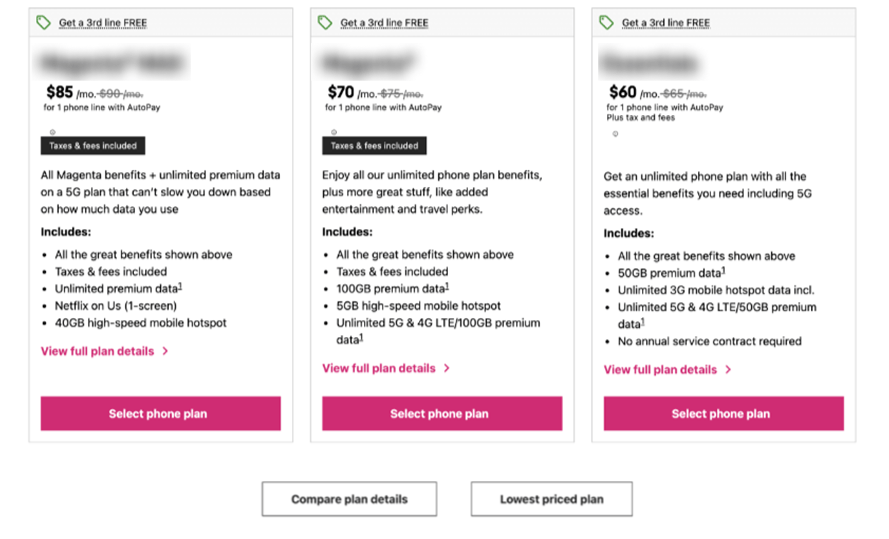
deceptive.design – In this example, a hidden link at the bottom of this page from a major telecoms group reads “Lowest priced plan”. Unlike the other plans, no price or information is displayed for this plan.
- Privacy zuckering: Manipulating users into sharing more personal data, often by hiding privacy settings.
- Roach Motel: Facilitating entry into a process (registration, subscription) but complicating exit (difficult unsubscription).
- Sneak into basket: Add items or services to the basket without the user’s request, requiring an action to remove them.
- Trick questions: Ask ambiguous questions to trick the user into choosing an option they don’t want.
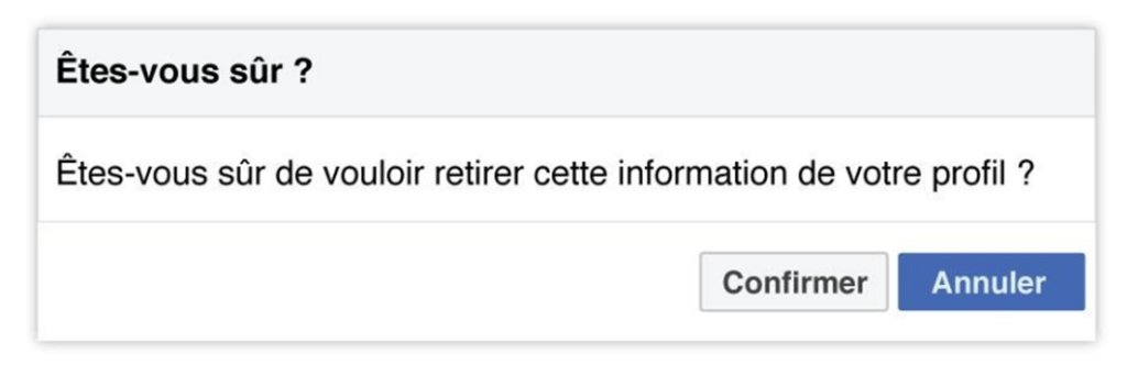
Facebook.com – Here, to remove information from your profile, you tend to click on the blue button to confirm your choice. However, it’s the white “Confirm” button that validates the action.
- Confirmshaming Use guilt to push the user to accept an offer, such as “No, I’d rather pay more”.
- Sneaking: Hiding information or adding charges without the user’s explicit consent.
- Urgency: Create a false sense of urgency (e.g. “limited offer”, “only 1 in stock”) to urge the user to make an immediate decision.
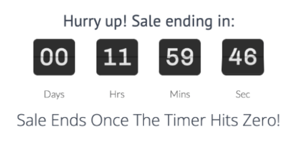
deceptive.design – Here, the user is urged to indicate the end date of the offer with a countdown timer.
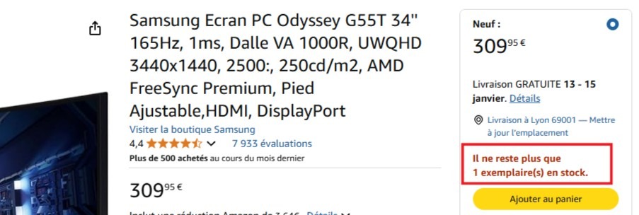
- Scarcity: Simulate artificial scarcity to encourage immediate purchase, such as displaying fake limited stocks.
- Obstruction: Making unwanted actions more complicated than necessary, such as having to go through several steps to unsubscribe or refuse an offer.
These dark patterns are constantly evolving, with new types appearing regularly without necessarily being identified, and they can even be combined to create manipulations that are even more subtle and difficult to detect.
But why do dark patterns work?
Dark patterns are based on cognitive biases and weaknesses of the human brain. The human brain is lazy and is always looking for quick and easy solutions, leaving users vulnerable. For example, recommendations such as “most popular” exploit the conformity bias, influencing the user through social pressure not to go against what is perceived as a popular or recommended choice.
Similarly, artificial shortages such as “Only 2 items left in stock!” take advantage of scarcity bias to create immediate buying pressure. In a hurry and often distracted, users easily fall into these powerful traps.
Netflix and Amazon: when the web giants manipulate you too
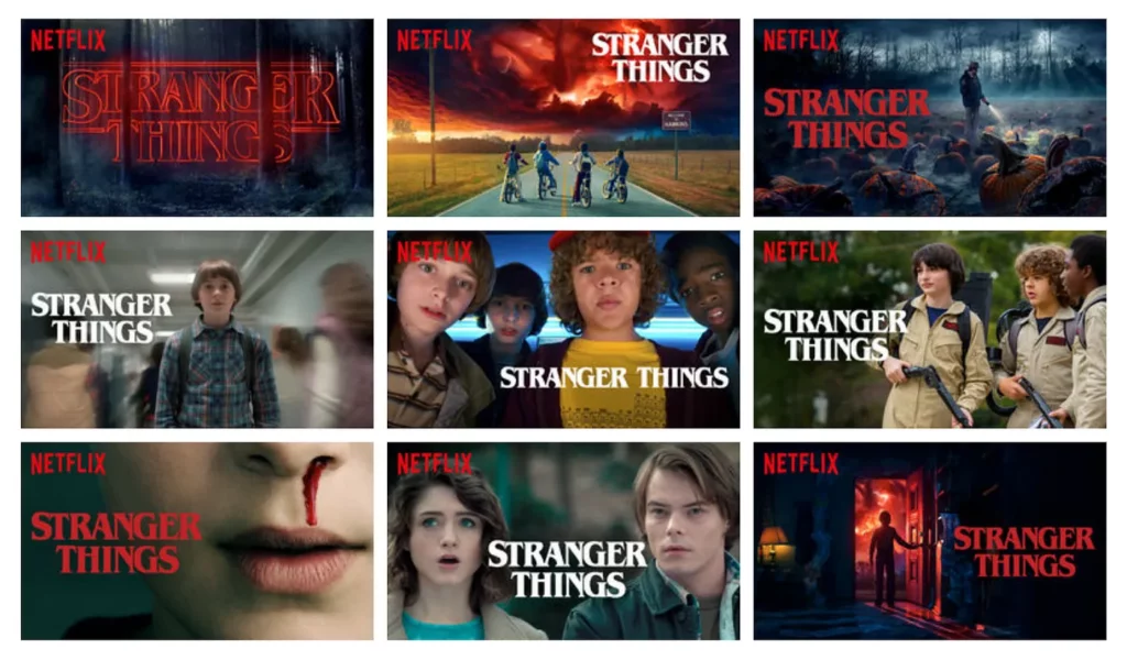
Dark patterns are ubiquitous and can be found even in the practices of the biggest companies, often without users being fully aware of them. Netflix, for example, uses subtle techniques to capture the attention and direct the choices of its subscribers without them realizing it. There are several thumbnails for the same series or film. They change according to each user’s preferences, subtly influencing their viewing decisions. If you’ve been watching series in the horror/horror category, you’ll certainly be offered the darkest thumbnails of Stranger Things.
Amazon also employs similar strategies, playing on the sense of urgency with limited stocks displayed, which don’t always reflect reality, driving impulse buying.
The absurdity of hidden clauses
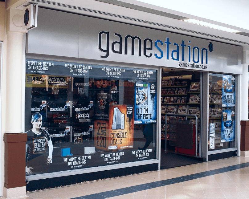
Some companies go even further, inserting absurd clauses into their terms and conditions to test users’ attention (or rather, inattention). A striking example is GameStation in 2010, which added a clause stating that users gave up their souls by accepting the terms, and nearly 7,500 people validated without even reading.
In another case, an antivirus software company, PC Pitstop, hid a clause in its terms and conditions promising $1,000 to the first person to discover it. It took four months and over 3,000 downloads before an attentive user claimed the reward, proving that even the wackiest and most advantageous offers can go unnoticed in the sea of T&Cs.
What about penalties? What does the law say?
Faced with the rise of these deceptive practices, several regulations have been put in place to protect consumers. In France, the DGCCRF stipulates that unfair, abusive or misleading commercial practices may be sanctioned by :
- A fine of 300,000 euros and two years’ imprisonment for an individual.
- A fine of up to 1.5 million euros for a legal entity.
- Up to 10% of annual sales for serious offences.
How can users protect themselves, and how can designers help?
To avoid falling into the traps of dark patterns, it’s essential to take a few simple but effective precautions. Even if they may seem tedious, carefully reading general terms and conditions of use can help you avoid unwanted commitments. Simply scrutinize the key points to spot any abusive clauses.
Next, it’s important to regularly check your account privacy settings and refuse non-essential cookies, to better protect your personal data.
Finally, it’s crucial to take your time before making a decision: don’t get carried away by artificial urgency or misleading recommendations, compare prices and read external reviews to make informed choices.
To design interfaces that respect users, it’s essential to adopt concrete, ethical practices that focus on their needs. For example, using clear labels on action buttons, such as “Accept” and “Decline” instead of ambiguous wording, makes choices transparent. Regularly auditing interfaces for dark patterns such as pre-checked boxes or complex unsubscribe paths is also crucial. This helps to correct the invisible manipulations that sometimes creep into designs.
In addition, promoting transparency by clearly displaying information on additional charges at the start of the purchasing process, or by explaining how user data will be used, strengthens trust and the user experience.
The future of dark patterns: towards more ethical design?
With evolving regulations such as the Digital Services Act and the RGPD, pressure is mounting for companies to comply with more ethical standards. Dark patterns risk becoming obsolete in the face of increased vigilance from users and regulators alike.
Dark patterns pose a major challenge to the ethics of digital design. While they may seem profitable in the short term, they undermine user trust and expose companies to legal risks. As UX expert Jared Spool points out: “Design isn’t just how something looks, it’s how it works […] and if it works by deceiving, it’s doomed to fail”.
For a healthier digital future, it’s crucial to design interfaces that are honest, transparent and focused on user needs.
Want to create a unique, responsive website?
At Lùkla, we help you design ethical and efficient interfaces, whether for a new project or a redesign, with our experts and the best tools. Contact us atLet’s work together to create respectful and engaging experiences.