Information technology and the digital world are fields where energy consumption is increasing rapidly.
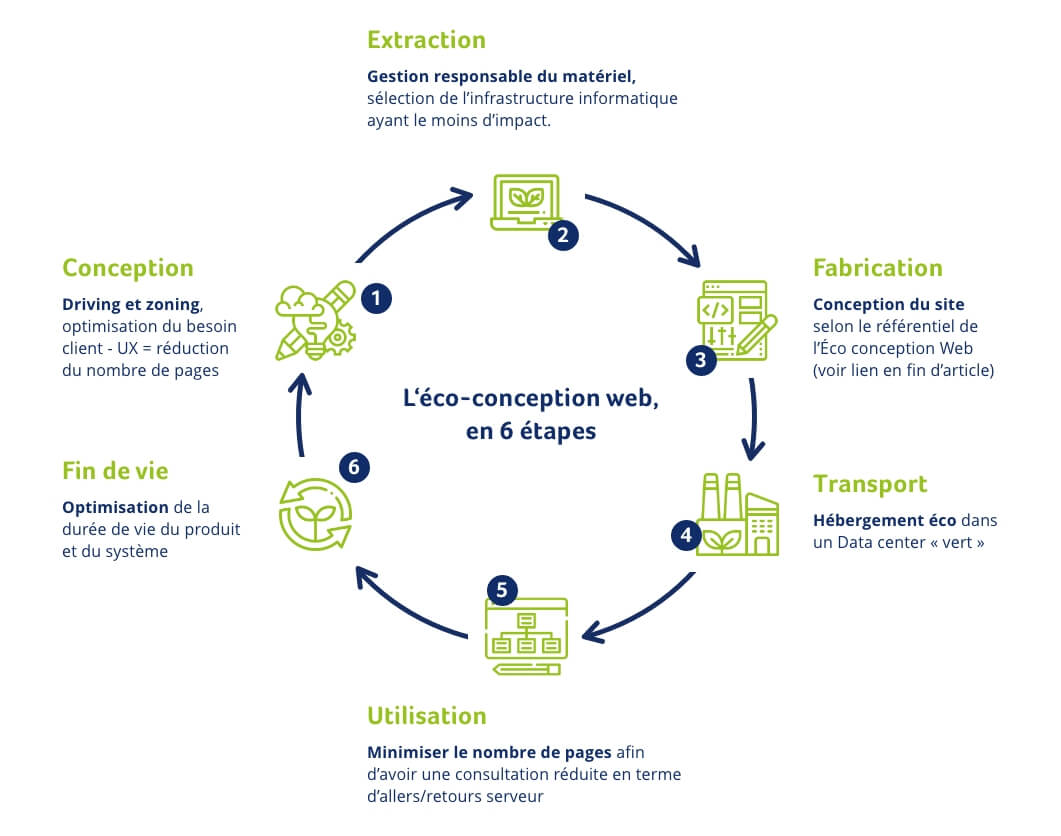
By following certain principles of ecological web design, it is possible to create a low-consumption site without losing quality of user experience. Digiwin can support you in your eco-design approach. In this article, we’ll discover how digital technology is harming the environment, and what levers can be put in place to reduce the ecological impact of the Internet in the near future.
What is web eco-design?
Web eco-design means orienting website design towards more ecologically responsible actions. UX/UI designers can take action to reduce this consumption by designing more energy-efficient websites, focusing on interface performance and consumption.
How do digital devices affect the environment?
Today, 22 billion digital devices are in use, each consuming a share of energy, while the Internet is used by over 4.5 billion connected users every day. With so many users, so much data and so many technologies in use, energy consumption is multiplying at breakneck speed.
Digital clouds and huge databases are needed to support and store all the data we consume on a daily basis. Once again, these servers are powered by electricity. Every file stored has an influence on the carbon footprint of an individual or a company.
Why green web design?
In an age when people are trying to reduce their footprint on the planet, the web is important because every byte consumes energy and storage. The same is true of terminals (smartphones, computers, tablets, etc.), which degrade over time.
Applications, websites and databases are getting heavier and heavier. Between the images, videos and technologies used, many elements are likely tolead to excessive energy consumption andCO2 production.
When we design websites, we inevitably think about the UX, the product, the UI, the functionalities… but rarely about the ecological consequences of the design we’re creating. However, if each web interface applies certain key principles, it is possible to considerably reduce the web’s ecological impact.
How can eco-design be applied to the web?
#1 Limit the use of images, optimize and reduce videos
- Images are omnipresent in all the sites we visit every day.
However, their accumulation represents a colossal amount of data. The first objective for optimizing a site and making it more economical and ecological will be to reduce the size of visuals by minimizing their weight and use. An image can be present in several places on a site and still be treated differently, using CSS filters for example.

- Videos have also become widespread on the web.
You’ll also need to check the real usefulness of this type of resource-hungry media, and make sure they’re short, in low resolution and compressed as much as possible. Videos that launch automatically should also be avoided. It’s important to leave it up to the user to decide whether or not to view the media, so as not to add unnecessary loading.
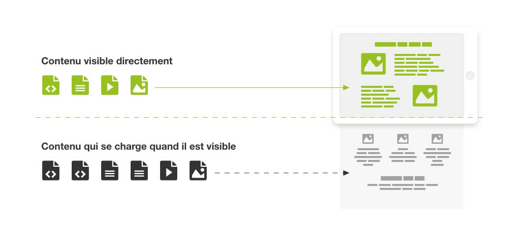
#2 Use lazy loading to load your images and media
Another trick is to use lazy loading. This solution allows you to load your visuals offline, according to the user’s needs.
This is because only the media visible on the screen are loaded by the browser, the others appearing when the user scrolls down the page. With lazy loading, your media are not unnecessarily solicited. Delayed loadingsaves energy and speeds up the loading time of your website.
#3 Use an eco-friendly hosting solution
Green” hosting can have a major impact on making your website “Green”. Get closer to hosts who use sustainable energy sources (geothermal, hydroelectric, etc.). This will considerably reduce your environmental impact.
#4 Remember to recycle your components
To optimize loading time, the design of your UX / UI should be based on a “design system” vision. design system “. The use of components that can be integrated in several places on the website makes it possible to reduce CSS code by using standard blocks and predefined styles upstream, so as not to rewrite new code for each page and thus reduce the weight of the design style file.
We use “minified” code to save space in terms of file size, a technique that can be used for CSS and JS. For Javascript code, you can work with Vanilla JS, for example, which is not a framework but simply means “naked”. It’s library-free JavaScript, much lighter than JQuery.
We use the “less is more” principle, which Digiwin implemented for the Loire-Atlantique department with a design system applied to 5 websites and intranets.
#5 Minimize the number of fonts
It may seem like a detail, but the multiplication of fonts also has an impact on data consumption, and by the same token, the loading time of your page. Limit yourself to a maximum of two or three fonts. Also, don’t import the whole family if you only use regular and bold, for example. Set yourself a variable size for your H1, H2 etc. headings, and integrate them into your design system for better transversality and sharing of your graphic eco-design.
#6 Think responsive
For several years now, the use of our cell phones has been omnipresent in our daily lives. Traffic from computers is no longer as important as it used to be. Websites must be designed to be responsive, adapting to the screen format.
One solution for reducing loading times is to go one step further and create a ” mobile first ” site. In this case, the website is designed for the mobile format first, with lighter graphics and clear, fluid navigation. The result is optimized loading times and therefore less resource consumption.
#7 Easy navigation and accessibility
- Keep navigation simple and efficient.
Complex navigation is extremely detrimental to the user experience. The more time a person spends looking for the information they need, the more pages they’ll navigate. Clear, fluid ergonomics limit the number of pages loaded and increase user satisfaction. The key to web eco-design is simplicity, minimalism and efficiency.
- Design with accessibility in mind.
Clean code adapted to disability software will ensure that the site is accessible to all. Digiwin, with its Accessiweb-certified accessibility experts, has been helping its customers achieve RGAA compliance for many years. The aim of an RGAA 4-compliant site is to offer platforms that can be used optimally by all categories of audience, whether disabled or those less familiar with digital tools.
Eco-design is still in its infancy, but the environmental factor is set to take on an increasingly important role, and is already entering the collective consciousness. Eco-design needs to be taken into account from the outset of a project. And, of course, you’ll need to allocate adequate resources and thought during the UX development phase. To find out more, read Frédéric Bordage‘s“Ecoconception web : les 115 bonnes pratiques“, a reference guide introducing the concepts of web eco-design.
From image to navigation, Ecological Web Design proposes a way of thinking that reduces the energy and environmental impact of our internet and intranet sites.


